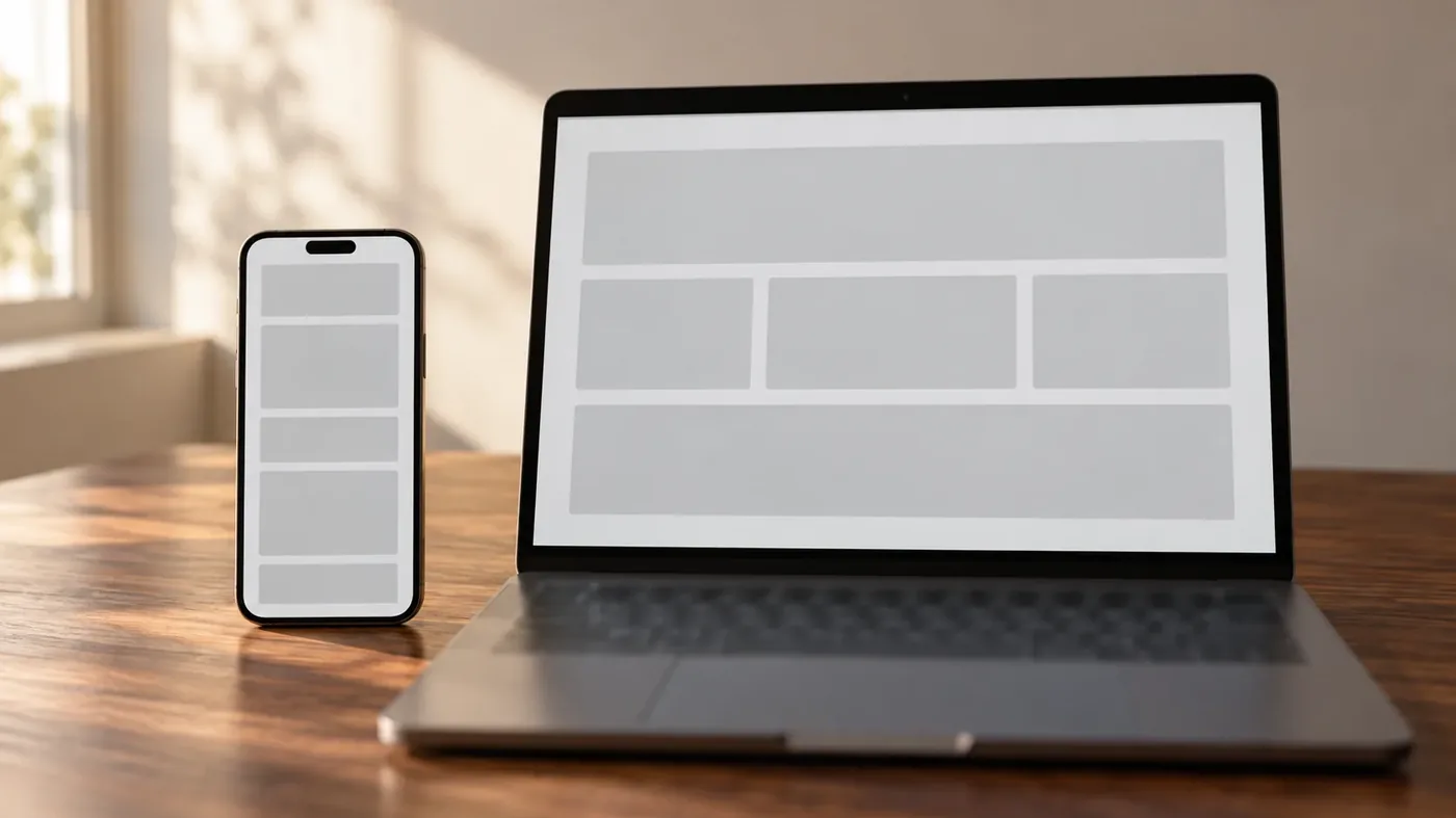
Most of your customers are on a phone. Most Shopify themes treat the phone as the desktop layout with the columns stacked. Those two facts do not sit comfortably together.
Responsive design solved a real problem: one site that does not break on a small screen. But responsive only promises that nothing overflows. It does not promise the result is good.
I rebuilt a client's main browsing section recently as its own composition rather than a scaled-down version of the desktop one. Different stacking order, different image crops, different type sizes. Same content, arranged for the device actually in someone's hand.
The usual pattern: a three-column row on desktop becomes three stacked rows on a phone. Nothing is broken. But a row that took one glance on a laptop now takes three full screens of scrolling, and the thing that made the row make sense, seeing all three at once, is gone.
Hero sections suffer the worst. A headline sized to fill a wide screen becomes enormous on a narrow one, and the subheading and button get pushed below the fold. The first thing a phone visitor sees is one giant word.
On one store, a client emailed me a screenshot of the homepage headline printing straight over the product lettering behind it. I could not reproduce it. My phone was fine.
The cause was that the headline and the subheading shared one layout row, and that row's height was being set by the images either side of them rather than by the text. The headline was sized relative to screen width, so it grew as the screen got wider. Past a certain width it outgrew the space, and the subheading had nowhere to go but on top of it.
Measured: clean up to 390 pixels wide, six pixels of overlap at 414, twenty-five pixels at 480. His phone was wider than mine. That is the entire reason one of us saw it.
Stacking order. The order that reads well in columns is rarely the order that reads well in a single file. On a phone, the thing that earns the scroll should come first, even if it sits third from the left on desktop.
Image crops. A wide product shot with breathing room either side works on desktop and wastes half the screen on a phone. A tighter crop of the same photo carries the same information in the space you have.
What gets dropped. Not every decorative element needs to survive the trip. Scene detail that adds atmosphere on a wide screen becomes clutter competing with the buy button on a narrow one. Deciding what to remove is part of the design, not a failure of it.
Open your store on your own phone, then open it again in your browser's device preview at 320 pixels wide, which is still a real phone size. Scroll to the buy button and count the swipes it takes to get there.
Then turn your phone's text size up two steps in accessibility settings and reload. A meaningful share of your customers browse that way permanently, and it is where fixed-height layouts fall apart.
Do not test only on the newest, largest phone you own. The bug above existed specifically on wider phones, and it was invisible on mine.
The point is not that mobile deserves more attention than desktop. It is that the phone is a different shape, holding a different amount of attention, and a layout that was designed for one and mathematically resized for the other will feel like exactly that.
If your analytics say most of your traffic is mobile and your design conversation still starts with the desktop mockup, that is the gap.
Related reading: Why cutting 213 MB did not make the store fast How to tell if you can edit your own theme
Does your store work on a phone, or just fit on one?
Take the free 2-minute audit, or send me your URL and I'll tell you where the mobile experience is costing you.
Take the free audit → Or book a call